Measure me in Units
What units of measure can we use in our CSS to provide such things as font size, margins, padding and widths. There are many, including px, em, rem, vh, vw and even %. What does it all mean and how should we use these units?
The structure of an `HTML` page; the hierarchy of the elements.
We should just remind ourselves about this, because some of these important units are relative – relative to the settings on their parent element.
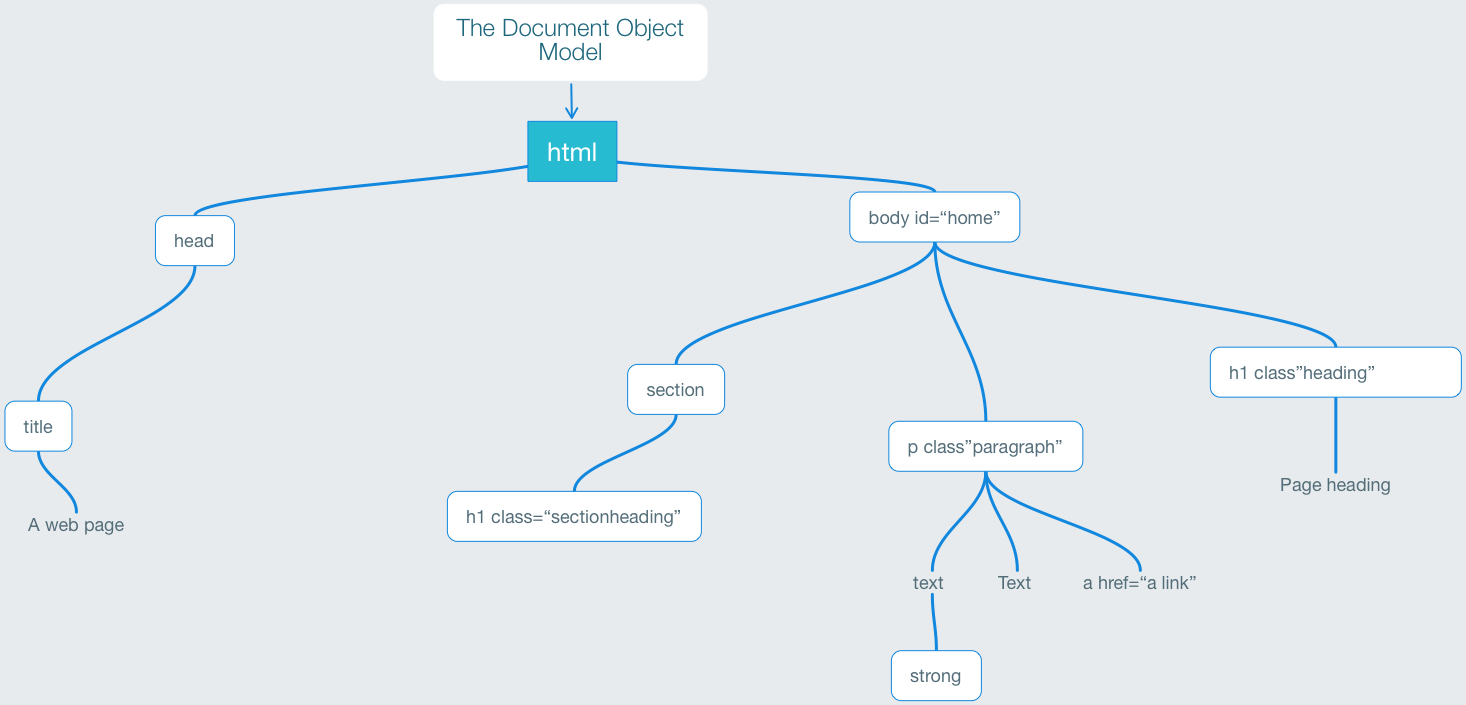
We have <html> as the root element with <body>as the main content. Within this we will have a number of block level elements such as headings, paragraphs, sections, navs and articles.
OK, now what about the units. Let's talk font size.
By default the root element (HTML) will already have the font size set to 16pixels; meaning that a paragraph of text will display a 16pixel height even before you begin to add CSS styles. All elements such as headings and lists will be proportionally based on this number. So, when the default is 16px the following will be true:
h1 is   32px   (2em)
h2 is   24px (1.5em)
h3 is 20.8px (1.3em)
h4 is   16px   (1em)
h5 is 12.8px (0.8em)
h6 is 11.2px (0.7em)
p is 16px (1em)
To make use of this value without using pixels we can use the rem unit. This is the root em. By default as I say this will be 16px. So if we change the font-size on the root (HTML) element, this will change everything.
Use rem wherever possible
If we use the rem unit, we can conveniently change the size of everything in one place (the HTML element) in the CSS. Also, if we avoid using pixels for units, we respect any changes that the user adjusts in their browser.
Here is an example of CSS that uses the rem unit. This CSS is heavily commented for the explanation.
/* this css file makes use of the REM unit rather than pixels */

/* by default the HTML root element will have a 16px value set on which all dimensions are set. This can be used in the child element (body) by reference to the EM unit. So a margin on the body of 1em will be the equivilent to 16px. However, we can change the value of EM in the HTML root element */

html {
  font-size: 10px; /* this would normally be 16px */
}

body {
  margin:2rem; /* this would be 20px */
  /* 2em would work as well but that is becasue body only has one level above */
}

p {
  /* with nothing here the font-size will be 10px */
  font-size: 1.5rem; /* so here we say 1.5 X the root value of em */
}

h1 {
  font-size: 2.5rem;
}
Change the root rem value
For convenience we can change the font-size default value (normally 16px) so that our subsequent values within the body will be easier to calculate / visualise. After all, using something like 1.3rem, will be a tricky value - actually 16x1.3=20.8pixels. So, why not change the value of the default to 10px, then our value will be easier - a value of 1.3rem becomes 13pixels.
The difference between the rem and em unit
em simply means the font size of a particular element. So if I use 1em in the CSS, I am adopting the size of this particular element's font size. So if a paragraph of text uses the base font size - let's say 16px then 2em would be 32px. The em unit is relative to the font size of the element being addressed, whereas the rem unit is relative to the base or root font-size.
/*this presumes that the root font size is left as the default 16px */

h4 {
  font-size: 18px;
  margin: 2em; /*this will be 36px*/
}

h5 {
  font-size: 1.5rem; /*this will be 24px */
  margin: 2em; /* this will be 48px */;
}
Screen Units
Whereas the rem unit is relative to the base or root font-size (in HTML), screen units are relative to the viewport dimensions. There are 4 of these values that we can make use of in our CSS; they are percentage values. I will list these here and then we can use them in an example CodePen.
- 1vw is 1% of the width of the viewport
- 1vh is 1% if the height of the viewport
- 1vmin is 1% of the viewport's smallest dimension (could be vertical or horizontal)
- 1vmax is 1% of the viewport's largest dimension (could be vertical or horizontal)
Pixels? We don't need them at all
The things is that we can almost forget pixels for web design. I know I have mentioned pixels in setting up your root value, but beyond that we should be using rem and ems wherever possible.
Image sizes
I guess we are used to thinking about pixel sizes for images, but we never need to include the images size in the HTML we can then use percentages to deliver the single version at different sizes in diffeent contexts.
Rather than use the same image but delivered at different sizes we can also provide different size versions with the srcset tag:
The srcset tag
With this tag we can provide different images for different size viewports. Like this:
<img src="small_pic.jpg"
    srcset="small_pic.jpg 320w, medium_pic.jpg 800w, large_pic.jpg 1200w"
    alt="Image description">
The picture tag
The picture tag is useful if yu want to deliver different format images, so maybe a landscape version for large screen and a portrait version on mobile. Like this:
<picture>
  <source media="(min-width:650px)" srcset="landscape_pic.jpg">
  <source media="(min-width:465px)" srcset="portrait_pic.jpg">
  <img src="landscape_pic.jpg" alt="Sea" style="width:auto;">
</picture>