The basics of HTML and CSS
This is a very simple explanation of HTML with some examples.
What is HTML?
HTML is a markup language, specifically created to display pages within web browsers such as Google Chrome or Apple Safari. The syntax is very specific and elements exist within the grammar that will display content logically with some basic styling built-in.
Here is some simple markup to show a web page
<html>
<head>
<title>My Page</title>
</head>
<body>
<!--This is a comment-->
<h1>Page Heading</h1>
<h2>Sub title</h2>
<p>Some text in a paragraph.</p>
<p>Here is <em>another</em> paragraph</p>
<ul>
  <li>Here is a list item with a bullet point</li>
  <li>Here is a list item with a bullet point</li>
  <li>Here is a <strong>final</strong> list item with a bullet point</li>
</ul>
</body>
</html>
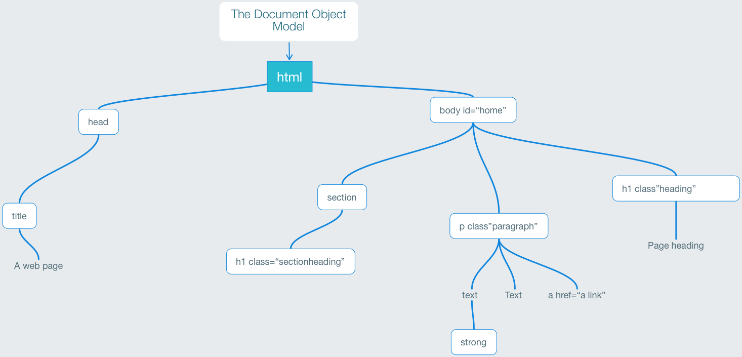
There is a hierarchy here with html being the top level (or parent) with body being the next level. All of these elements (shown in blue here) need to be closed; that is each element opening tag <body> needs to have a </body>.
Take a look at the <h1> tag on line 7 above. This is inside the body element. The body element is where all of the visible content goes. <h1> is a child of the body. The actual content for h1 (the top level heading) is inside the opening and closing h1 tag: <h1>Page Heading</h1>.
Structure
In the example above, there is another element at the same level as <body. This is the <head>. The head element can include metadata about the page. In this example, the only element within this is the <title>. This is the title for the page. The <body> and the <head> elements are siblings; their parent is html.
The HTML DOM (Document Object Model)
When a web page is loaded, the browser creates a Document Object Model of the page. The diagram here represents the structure of the DOM.

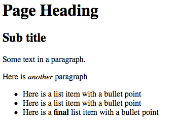
What does this example of HTML look like in a browser?

You will notice that there is some basic styling; we can see that the top level heading is the biggest and the next level h2 is smaller; there is space between the paragraphs and the list has bullets and is set in from the left of the page.
HTML has this styling built-in. As long as we use logical elements within the markup then the structure will itself be styled logically by default.1
Classes or how to get added control over the HTML markup.
We should use this structural logic with the HTML markup, but we can also differentiate between these elements by adding classes to the elements.
Here is that same markup from before but with a couple of classes added:
<html>
<head>
<title>My Page</title>
</head>
<body>
<!--This is a comment-->
<h1>Page Heading</h1>
<h2>Sub title</h2>
<p class="firstparagraph">Some text in a paragraph.</p>
<p class="bodytext">Here is <em>another</em> paragraph</p>
<ul class="items">
  <li>Here is a list item with a bullet point</li>
  <li>Here is a list item with a bullet point</li>
  <li>Here is a <strong>final</strong> list item with a bullet point</li>
</ul>
</body>
</html>
Presentation Logic
There will always be a need to present different components of content differently.
For example: - Headings need to look different from paragraphs - Poems will need to look different from the surrounding paragraphs - quotes will also need to be distinguished from normal paragraphs
To work toward this end we need to: - Organise the content in a logical structure (flow) - Use existing HTML elements - Use labels (classes) that identifies the type of content - Avoid labelling the information with mark-up that presumes a particular appearance
Types of Mark-up for HTML
Block elements are those which, by default, will begin on a new line and the content after will start a new line
Examples: paragraphs
<p>and headings<h1>,<h2>etc)
There are also box elements, that can surround other elements and provide structural control of blocks of content.
Here are some examples:
<div>- short for division and a general purpose block element<section>- this acts likedivbut expects certain internal elements like headings.<nav>- we would expect that to be a menu of some navigational components<header>- at the top of the page<footer>- at the bottom of the page
In addition there are list items:
<ul>- an unordered list (often a bulleted list)<ol>- ordered list (numbered)<li>- these are the list items inside those above
Inline elements are contained within a line
Examples: emphasised (
<em>) or bold (<strong>)
Text elements within block level elements can be marked up with <span> tags or default HTML
Examples:
<span class="booktitle"><em>- standard tag for emphasised text. Can be also be a<i>, and will be italic by default
Mark-up should be semantic and can use existing HTML tags
Examples:
<h1 class="authorname">
<h2 class="chapter">
<article>
There are many HTML elements
There is a lot to HTML. If this is your first view of it, don't be too concerned that you don't know all of it!. The best way to explore is by looking at the many web sites. In particular, the W3 Schools web site has comprehensive information.
Styling the HTML with CSS
Now we need to focus on the Cascading Style Sheets language,
Here is an example of some CSS:
body {
font-family: verdana,sans-serif;
}
h1,h2,h3 {
font-family: georgia,serif;
}
h1 {
  color:red;
  border-bottom:1px solid gray;
}
p {
margin-bottom:4px;
}
Each element can have many style attributes within the curly brackets. Each style rule must be separated with a semi-colon. This can be written in different ways; the example above puts each rule on a separate line, but it can be written like this:
h1 {color:red;border-bottom:1px solid gray;}
Syntactical Precision Required
CSS will not style the HTML properly if there are errors in the syntax of the stylesheet. If there is a missing semi-colon ; then the later rules will not be delivered. If there is a missing curly-bracket } all of the later CSS will not be delivered.
Inheritance
Structural elements can be contained within other elements
Inheritance can be used to target specific elements
For example: <em> within a title <h1> can be different than <em> within a paragraph <p>
Inline elements can be contained within paragraphs or other block level elements
Everything is contained within the document (HTML)
All displayed elements are contained within the root or <body>of the document which is unique and can have an ID.
Like this: <body id=“home”>
Defining the styles
The style rules can be within the page or outside in a separate file
Normally we use external style-sheets but: Using internal styles can be useful for developing page designs
Think about specificity
em {font-style: italic;} will define <em> everywhere to be italic but:
div#content h1 em {font-weight: bold;} will make <em> within <h1> within the content block bold as well as italic
Think about the cascade
body>block>inline
will define styles from <body> down
Further Details of CSS
Selectors
In CSS, selectors are patterns used to select the element(s) you want to style.
Example:
.subhead- this will target elements within the HTML that are tagged with a class name like this -<h2 class="subhead">
More than one selector can be used where the same style might be applied.
Example:
h1,h2,h3 {border-bottom:1px solid black;}
Reading order
The CSS style rules are parsed through sequentially, so later rules will take precedence over earlier ones.
Take this example:
h1,h2,h3 {
border-bottom:1px solid black;
}
h3 {
border-color:red;
}
Fonts
Fonts need to be defined in a list, as a family, so that when a font is not available on the user's device, the next available font will be used. Here is an example of that syntax:
body {
font-family: Georgia, "Times New Roman", Times, serif;
}
Using fonts from elsewhere
It is also possible to use fonts that exist on a server somewhere; for example from Google Fonts. This is an advanced technique that will be covered elsewhere.
Positioning
The HTML is normally delivered as a web page in the order that it is coded. But it also possible, with CSS to position elements out of their normal flow.
There is more than one way to do this.
Float
When an element is set to float (left or right), then it will shift away, allowing the following content to move up and alongside.
- The Float property for a block level element also removes it from the normal flow of the document
- Other following elements on the page will move out of the way of the floated element.
- Floated elements need to have a width declaration as well
- Blocks can also have a z-index defined to accomplish stacking
Defining by a Position Rule
There are 4 type of positioning available: 1. static (this is same as no position set) 1. relative 1. absolute 1. fixed
Examples:
relative
.chapter_intro {
position:relative
left:20px;
top:30px;
}
absolute
.menu {
position:absolute;
top:0;
left:0;
}
In this example the menu block will be set at the top left of the body within the window. It will move, when the user scrolls down the page.
.copyright {
position:fixed;
bottom:0;
left:0;
}
In this example the copyright block will be fixed at the bottom of the viewport and will stay there even when the user scrolls their window.
Note
We would only use static if we need to reset the position to the default
Units of Measure
There are several units that can be used in CSS in order to set font sizes and dimensions of elements.
For example, if you want to set the width of menu in CSS you could use:
nav.menu {
  width:100px;
}
The alternatives
The units that we can use are listed here with an explanation:
- Pixels - indicated as
pxin the CSS rule, it is the smallest screen unit. Most systems will ignore fractions (such as4.5px) by rounding up. - em - The em unit is a relative unit; meaning that it represents the size of the current font.
2emmeans twice the size of the font within the parent block of the element. - rem - The rem is also relative, but this time it represents the value of the font size at the root level of the page. So, if the font size for the body is set at
12pxthen2remwill be32px. - Percentage - indicated as
%to create a dimension that is relative to the containing element. So if our menu is 100px wide, the sub menu could be defined as having a width of70%- making it70pxwide. - Viewport-relative Units - there are units that are defined as a percentage of the viewport width or height. These units are written as
vhfor 1% of viewport (the height of the browser window),vwfor 1% of the viewport width. There is alsovmaxandvmin.
There are many other units that can be used; some are specific for print (such as centimetres and point). Please read the information here, for further details.
I have another article all about Units here:
-
Web developers and designers often use a stylesheet to reset all of the standard styles to a neutral setting so they can, more efficiently, apply styles from a basic setting. In a reset.css stylesheet, all of the margins are set to zero. ↩